ZaposliSe emerged as Croatia's boldest disruption in the recruitment landscape, challenging traditional job portal conventions with an innovative swipe-based matching system. Operating in a market dominated by text-heavy listings and complex filters, ZaposliSe recognized that modern job seekers needed a more intuitive, engaging way to discover opportunities. Their revolutionary "Tinder for jobs" concept promised to transform how Croatians connect with potential employers, but translating this groundbreaking idea into a cohesive brand identity and functional platform required strategic finesse.
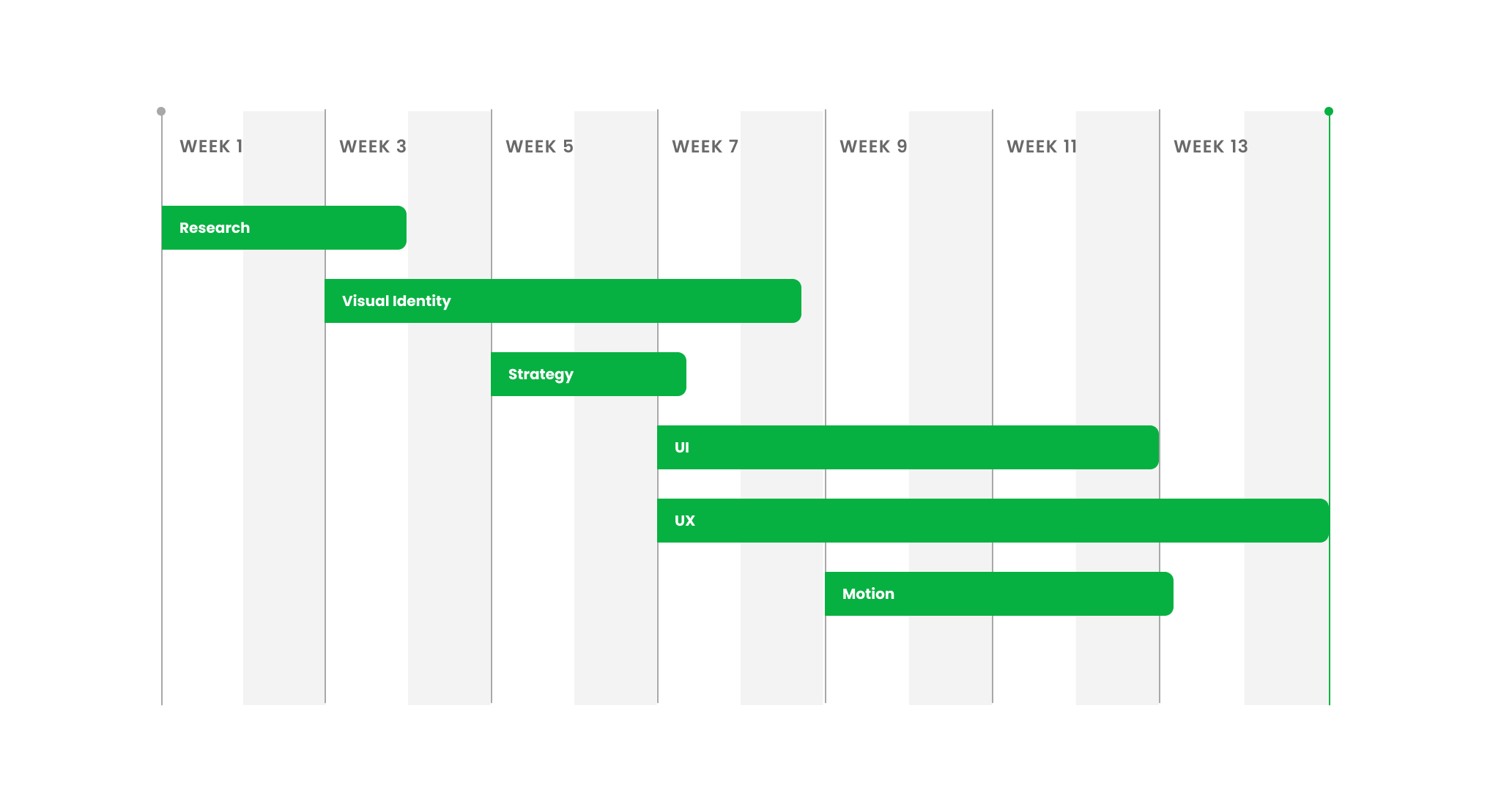
SCOPE OF WORK
- Visual Identity
- UI Design
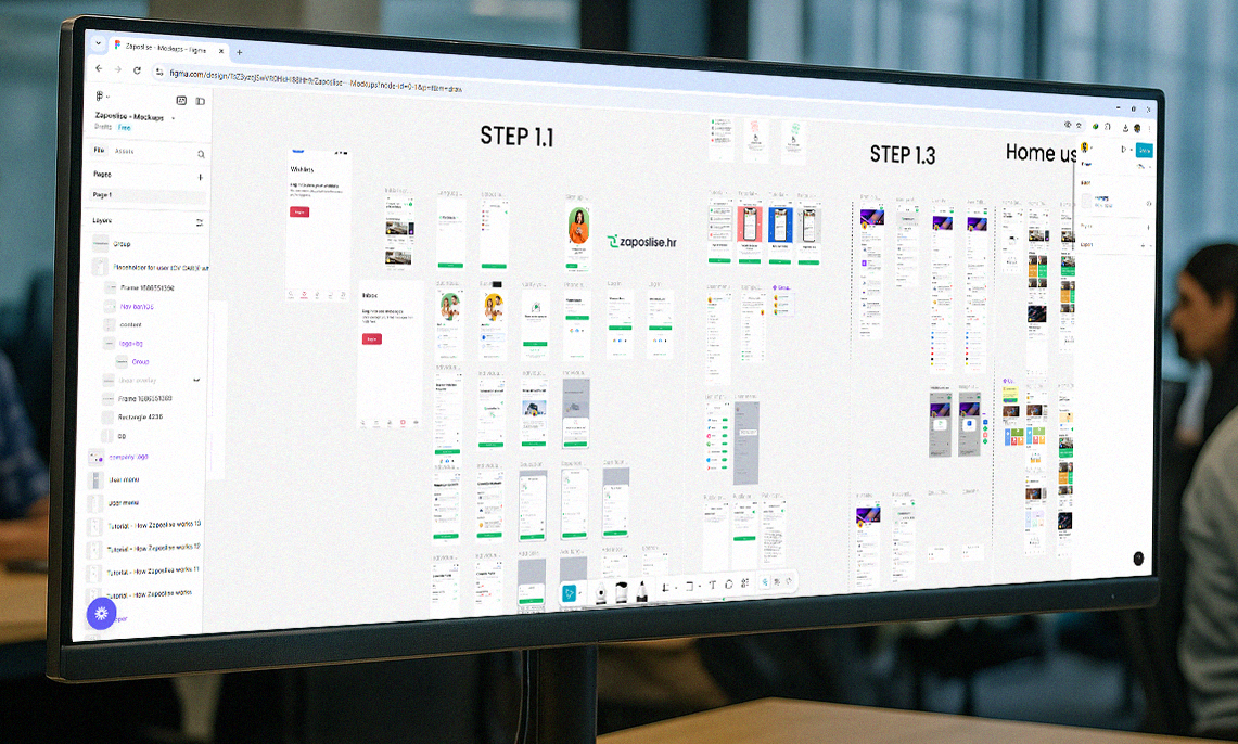
- UX Research
- Motion Design
The Brief.
When ZaposliSe's founding team approached us, they carried more than
just another job platform concept—they held the blueprint for a
cultural shift in Croatian recruitment. "We want to be the Tinder of
job searching," their CEO explained during our initial consultation.
"People should be able to swipe right on their dream job, not scroll
through endless, monotonous listings."
The challenge was intriguing yet complex. While the swipe mechanism
had proven successful in dating apps, applying it to professional
recruitment presented unique psychological and practical hurdles.
How do you condense a job opportunity into a swipeable card? How do
you maintain professionalism while embracing the casual,
instant-gratification nature of swipe interfaces? Most critically,
how do you convince both job seekers and employers that this
seemingly frivolous interaction method could yield serious
professional matches? Our team recognized that ZaposliSe wasn't just
building another job aggregator—they were pioneering a behavioral
change. Croatian job seekers were accustomed to methodical,
traditional application processes. Employers questioned whether
quality candidates would engage with a "gamified" platform. The
startup needed a brand identity that could bridge this gap:
sophisticated enough to earn professional credibility, yet
approachable enough to encourage playful exploration. The technical
brief was equally demanding. The platform needed to support complex
matching algorithms while maintaining the simplicity of a swipe
gesture. User experience had to be intuitive for both 22-year-old
digital natives and 45-year-old career changers. The visual design
needed to communicate trust, efficiency, and innovation
simultaneously.

The Approach.
Our strategy centered on humanizing the digital recruitment experience while maintaining professional integrity. We began with extensive UX research, conducting interviews with several professionals across different age groups and industries. The insights were fascinating: 73% of respondents expressed frustration with traditional job search methods, yet 68% worried that "superficial" swiping might overlook important opportunities. This dichotomy shaped our dual-approach philosophy. We would create a brand that celebrated the efficiency of modern technology while respecting the gravity of career decisions. The visual identity needed to feel contemporary and energetic, yet trustworthy and substantial.
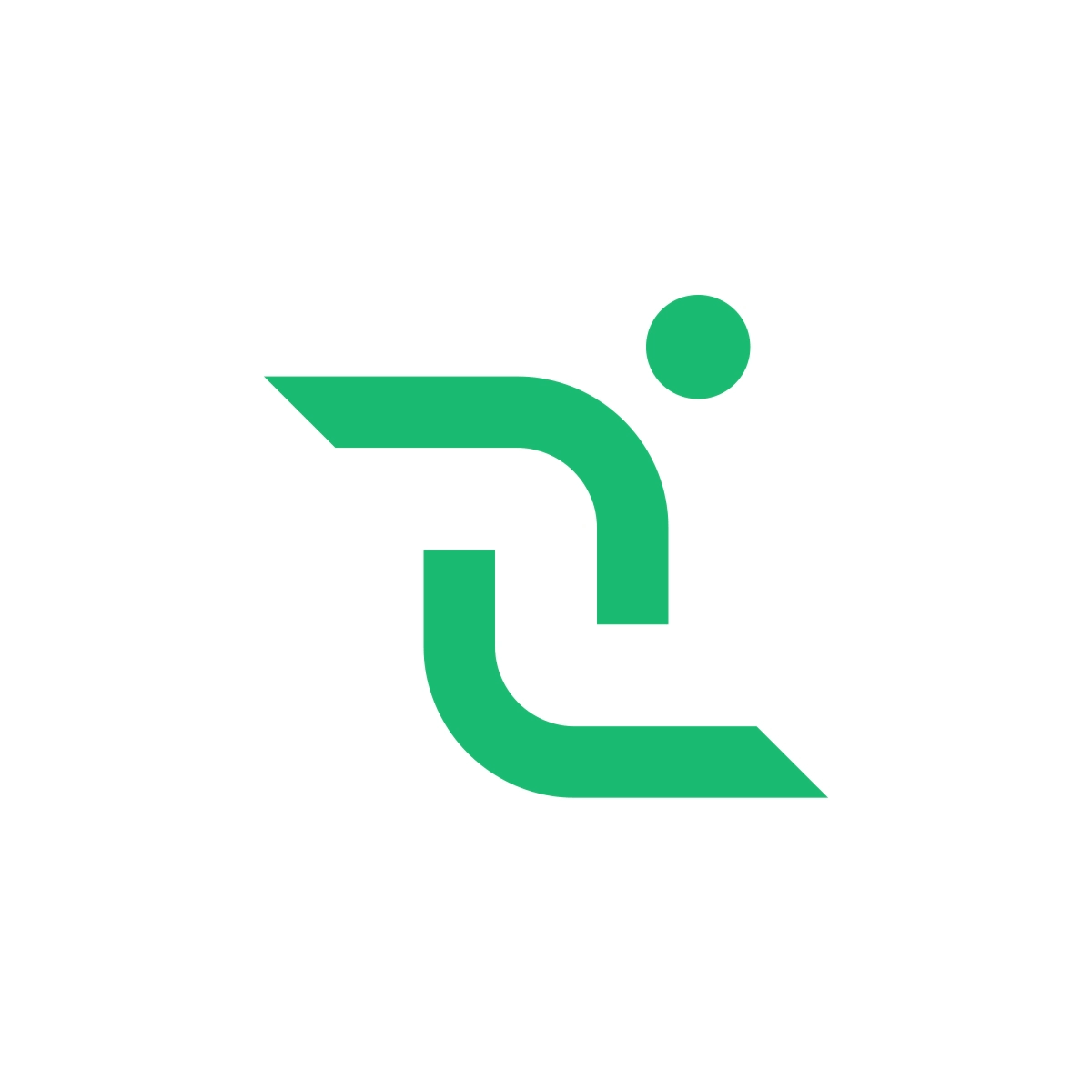
Logo.
The ZaposliSe logo embodies the perfect fusion of movement and stability. The abstract green shape, at first glance, evokes the image of a person in motion or reaching out. The circular dot represents the "head," while the angular curves suggest movement—symbolizing action, pursuit, or interaction. This is a visual metaphor for job seekers actively swiping, connecting, and progressing. The abstract "Z" formation uses flowing curves that subtly reference the swipe gesture fundamental to the platform's functionality. The geometric precision of the letterform maintains professional credibility while the organic curves suggest human connection and ease of use. The vibrant green execution reinforces the brand's optimistic, growth-oriented positioning while ensuring strong visibility across digital touchpoints. The logo's modular design allows for flexible application across various contexts, from app icons to corporate communications, maintaining brand consistency while adapting to functional requirements.
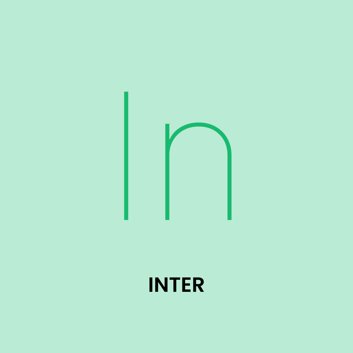
Typography.
Inter font selection reflected our commitment to clarity and
accessibility in professional communication. The font's
extensive character set and exceptional legibility at small
sizes proved essential for mobile-first job cards where users
make rapid decisions based on limited information.
Inter's geometric structure aligns with the platform's clean,
organized approach to job matching, while its humanist touches
prevent the interface from feeling cold or impersonal. The
font's versatility allows for clear hierarchy establishment
across various content types, from job titles to company
descriptions to user interface elements.
The typography system includes carefully calibrated size,
weight, and spacing specifications that ensure optimal
readability across devices while maintaining brand
consistency. Special attention was paid to ensuring that
critical information—job titles, company names, key
requirements—remained highly scannable during the rapid
browsing typical of swipe interfaces.

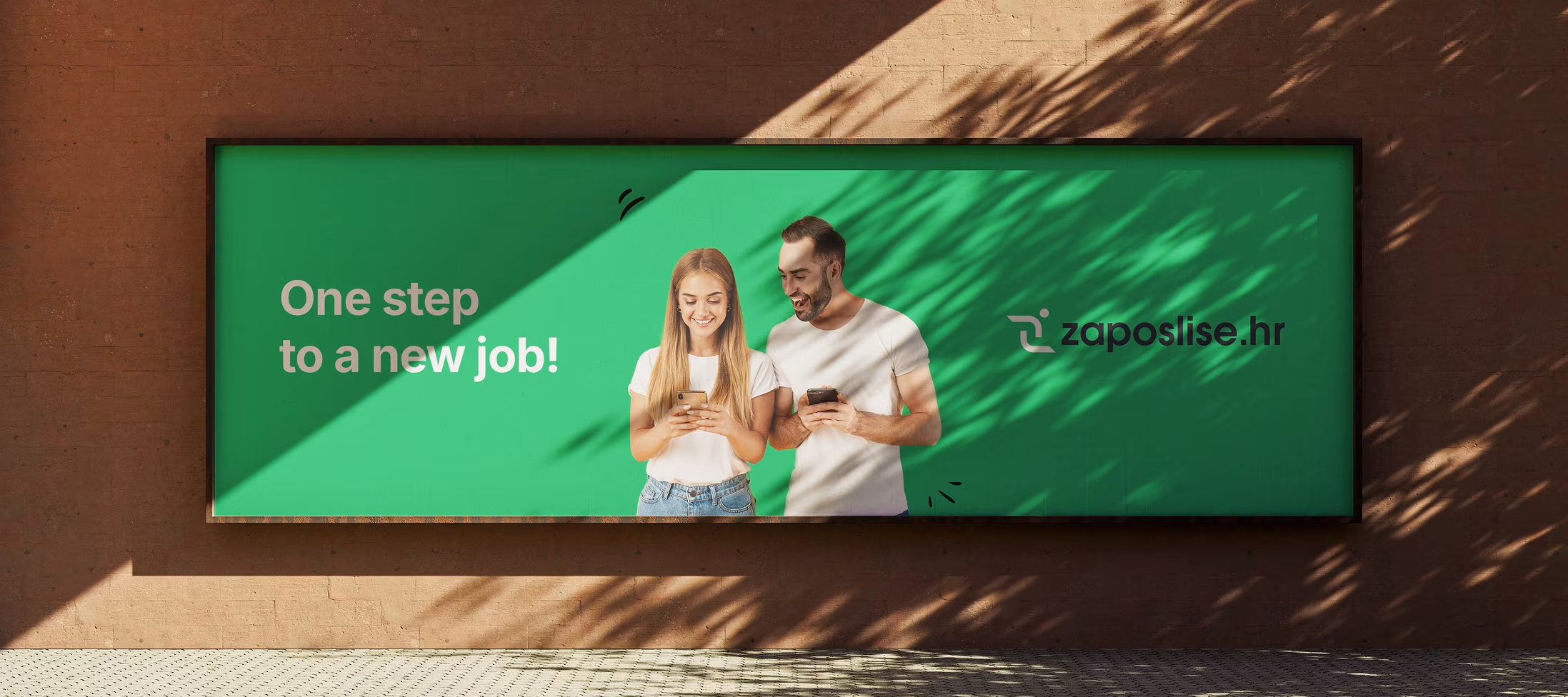
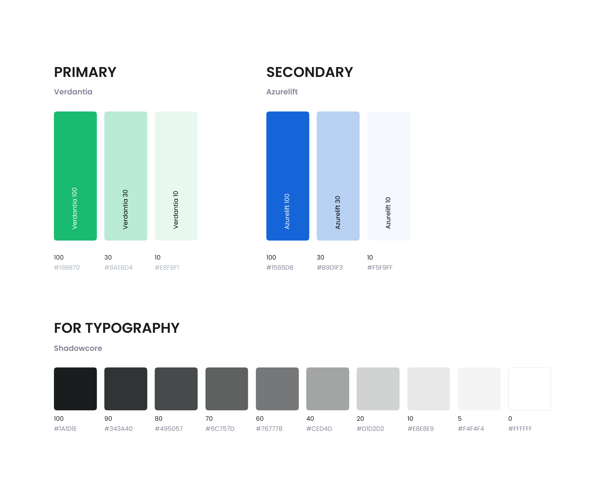
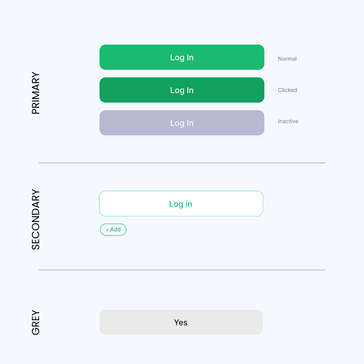
Color Palette.
The color palette represents a strategic response to the
psychological challenges of rapid career decision-making.
Primary green (Verdantia) was selected for its proven
ability to reduce decision anxiety while promoting
confidence—essential qualities when users are making career
choices through quick swipes. The vibrant green also
symbolizes growth, opportunity, and positive outcomes,
reinforcing the platform's promise of career advancement.
Secondary blue (Azurelift) provides technological
sophistication and establishes trust—crucial factors for
both job seekers and employers evaluating a new platform
concept. The sophisticated grayscale range (Shadowcore)
ensures professional readability across all content types
while preventing visual fatigue during extended browsing
sessions. Error states utilize a carefully balanced red that
communicates issues without creating alarm, maintaining the
overall positive user experience.
The color implementation extends beyond digital interfaces
to create a cohesive brand presence across all touchpoints,
from marketing materials to corporate communications.
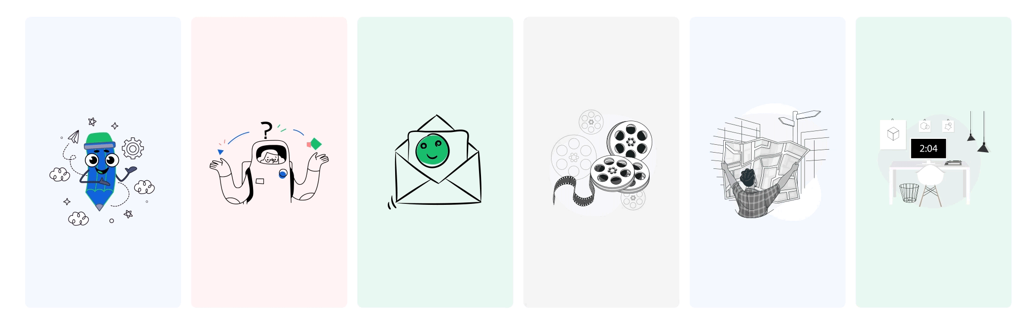
Illustrations.
The illustration system transforms potentially intimidating job search scenarios into friendly, approachable experiences. Each illustration serves both functional and emotional purposes, guiding users through the platform while reinforcing brand personality. The line-based doodle style illustration ensures quick loading times and scalability across devices while maintaining visual consistency. The illustrations use the brand's primary green strategically, creating visual anchors that reinforce brand recognition during user journeys.
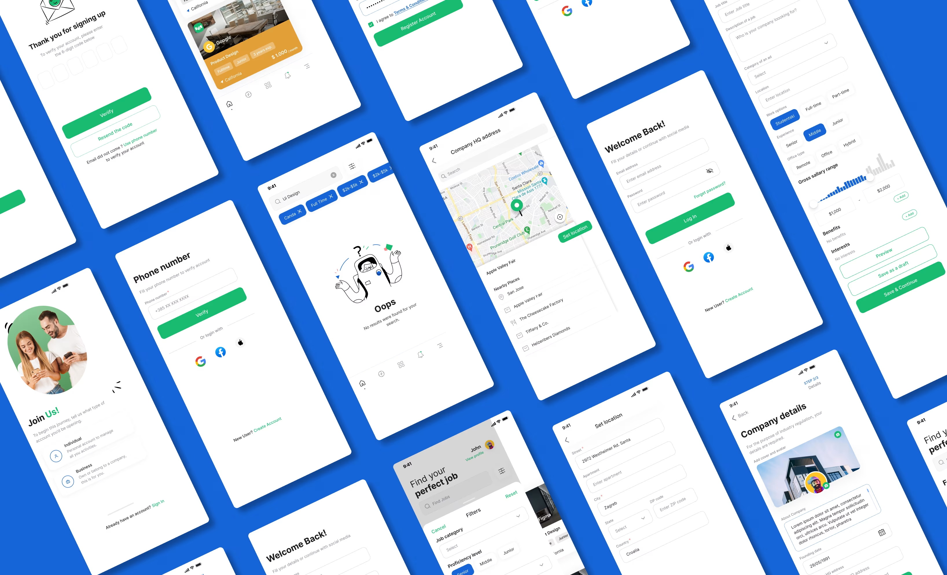
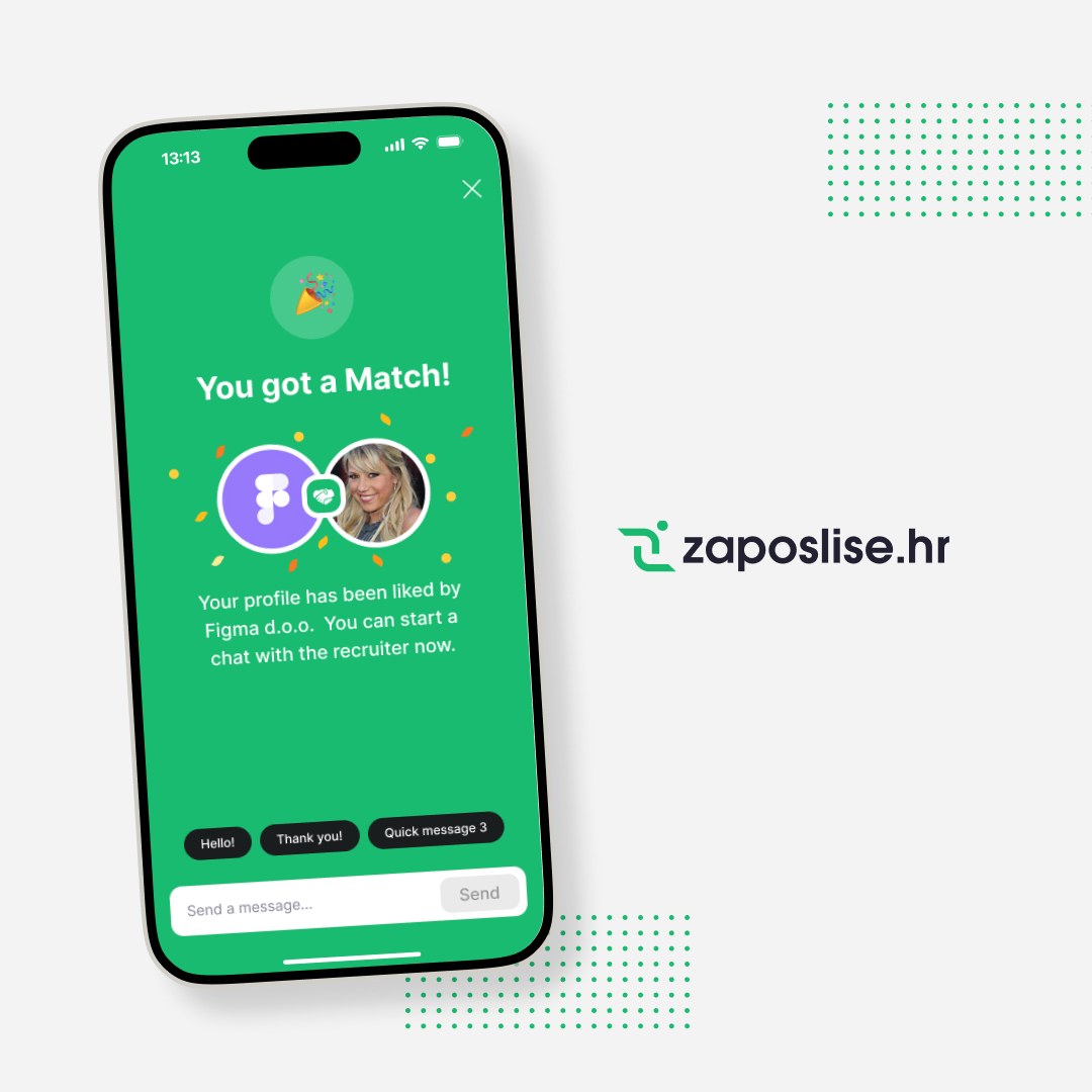
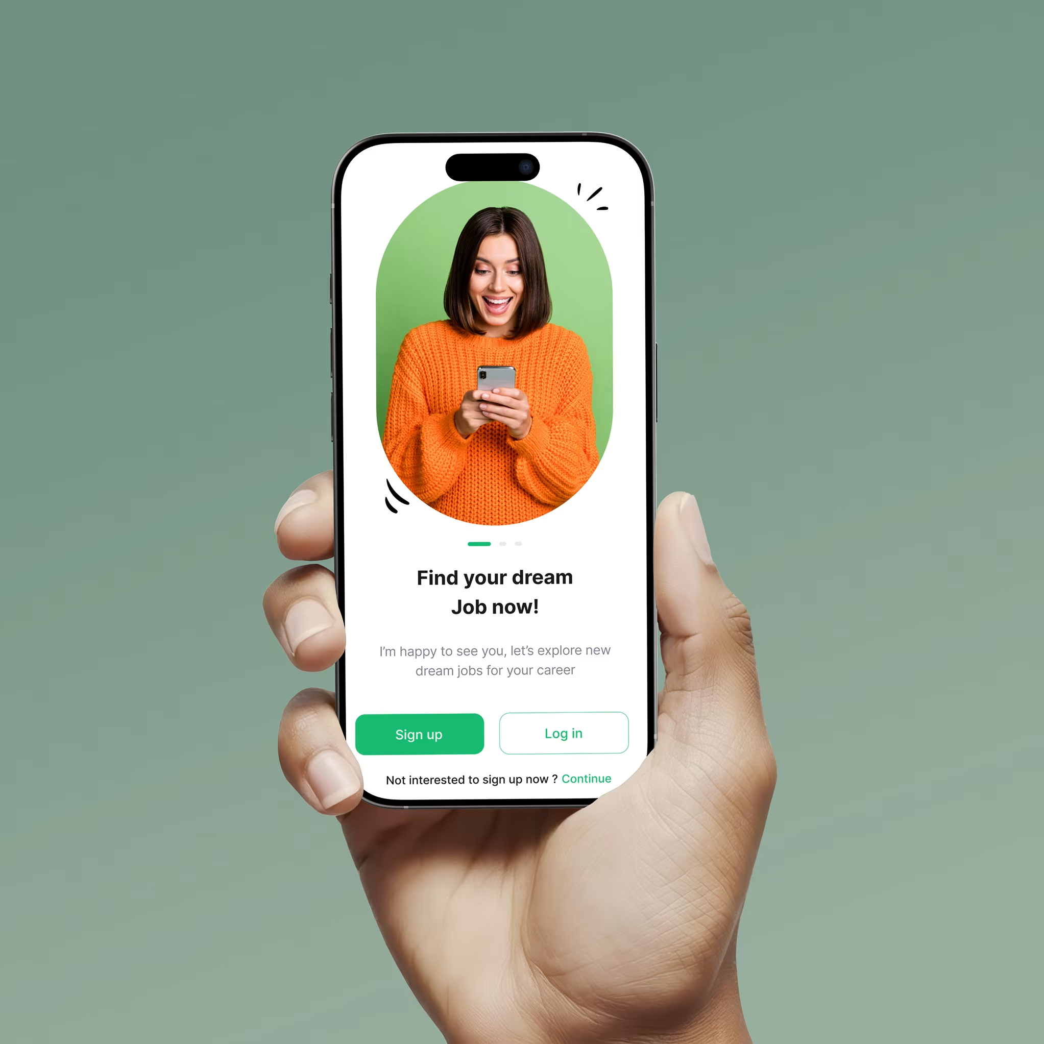
UI/UX Design.
The user experience design tackles the fundamental challenge
of making rapid career decisions feel both efficient and
thoughtful. Through extensive UX research involving several
professionals, we identified key behavioral patterns that
informed every interface decision.
Our UX research revealed that traditional job search anxiety
often stemmed from information overload and decision
paralysis. The ZaposliSe interface addresses this by
presenting curated, relevant opportunities in digestible
formats. Users can make confident decisions quickly, knowing
they can always revisit passed opportunities. The design
system includes sophisticated error handling and recovery
mechanisms, ensuring that accidental swipes don't result in
lost opportunities. User testing revealed that this safety
net significantly increased user confidence and engagement
with the platform. Accessibility considerations ensure the
platform serves users with diverse abilities and
technological comfort levels, supporting ZaposliSe's goal of
democratizing access to employment opportunities across
Croatian society.
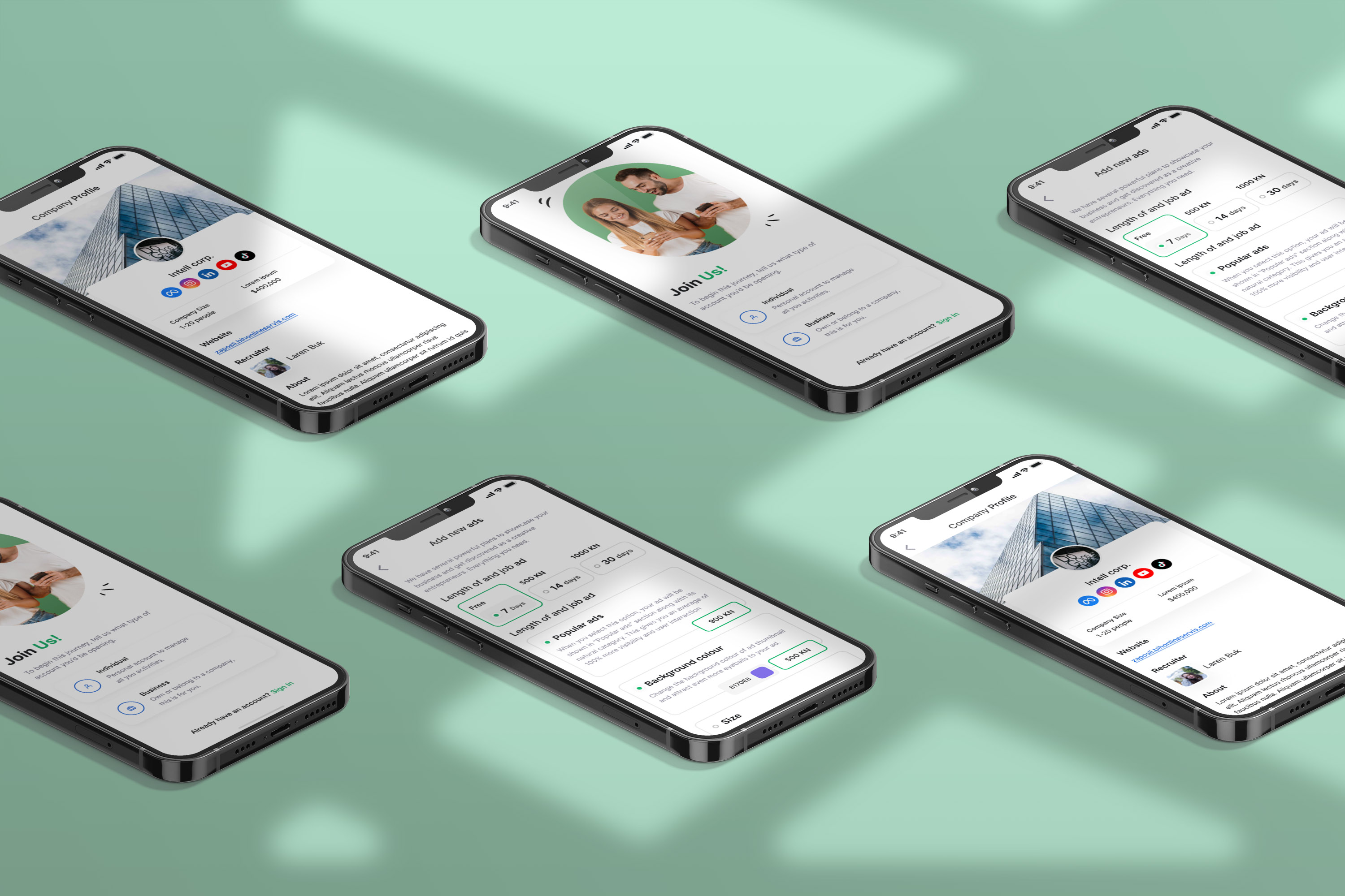

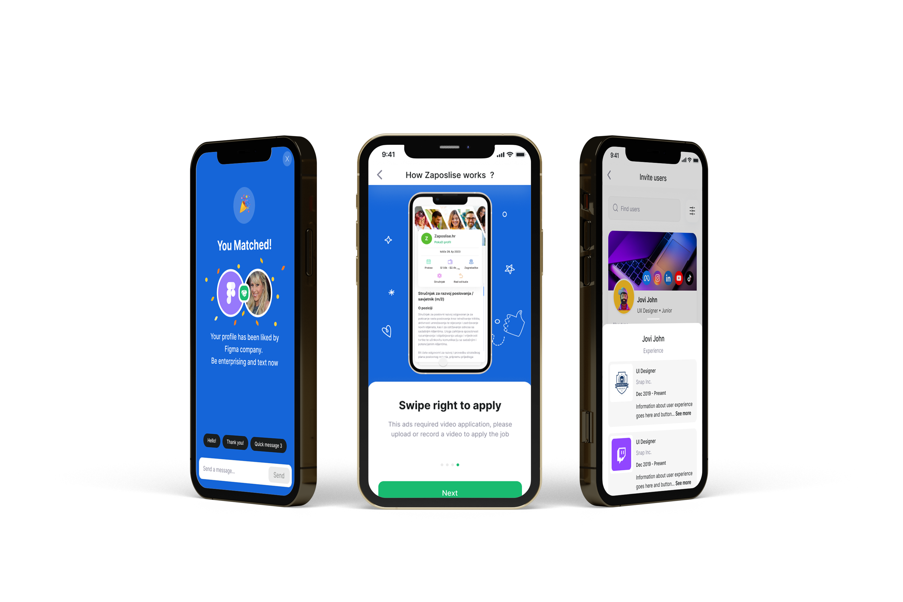
The core swipe interaction required careful psychological calibration. Card design presents essential job information in a hierarchy that supports quick decision-making while ensuring users don't overlook important details. Visual cues guide users through the decision process, with subtle animations reinforcing positive actions and providing clear feedback.